April 2021
In April, we have made some Platform back-end improvements to help our product grow, as well as released the visual aid of a Heat Map for Datasets and Meters in in Energy Tools.
Energy Tools
Alongside the Heat Maps, we have also worked on some bug fixes
Heat Maps
We are excited about our newest bit of functionality, the Heat Maps in Energy Tools! Heat Maps allow you to visually see your data and identify potential issues or positive changes.
Now, when viewing a Dataset or an individual Meter, tapping the Heat Map button will present you with a beautiful Heat Map of your consumption.
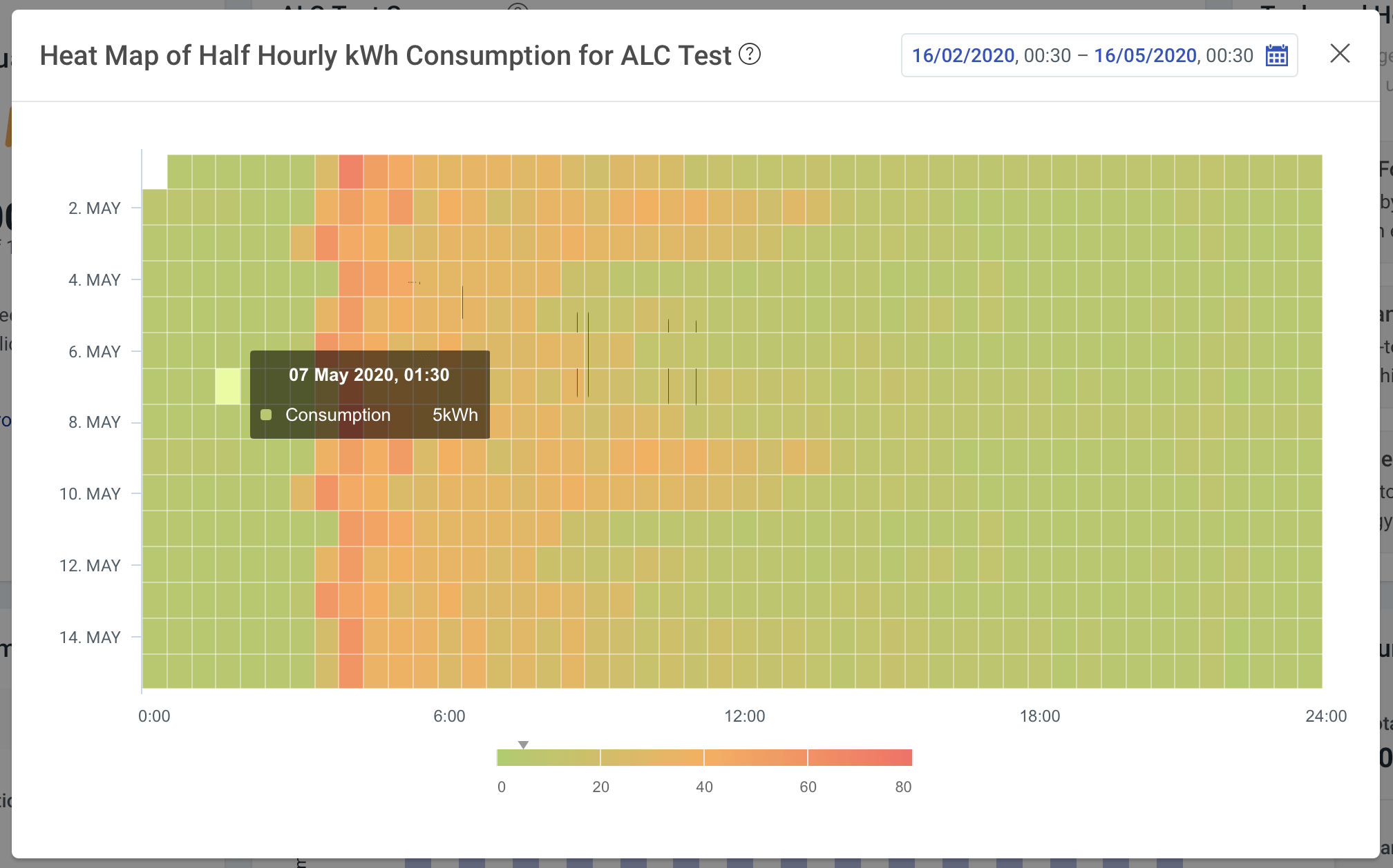
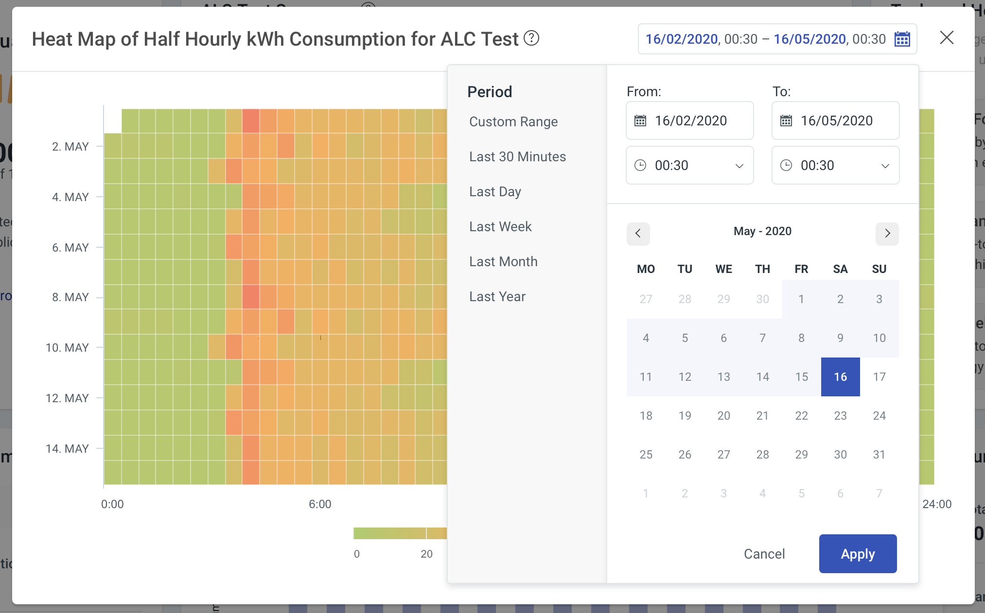
The Heat Map pulls your energy consumption for the selected Dataset or Meter and displays it in a colourful format so that you can spot trends and outliers over the selected time-period. By using the date selector, you can alter the timescale of the Heat Map by selecting the dates and times specifically or by using the pre-set periods.
There is also a snazzy navigator at the bottom of the modal, which acts as a colour key. It helps to show you where on the spectrum the block of colour that your cursor is hovering over sits.
With the Heat Map in Energy Tools, you can dig in and present your data in a helpful way to visually show an event or trend.