June 2021
June is the month of change, and we’re very excited to roll out the tabbed view in Energy Tools, alongside the Loss Prevention module rename to “Vision”, and some exciting enhancements to Analytics.
Energy Tools
As well as the introduction of the tabbed view, we’ve also improved some areas in the UI and some bug fixes.
Dataset Tabbed View
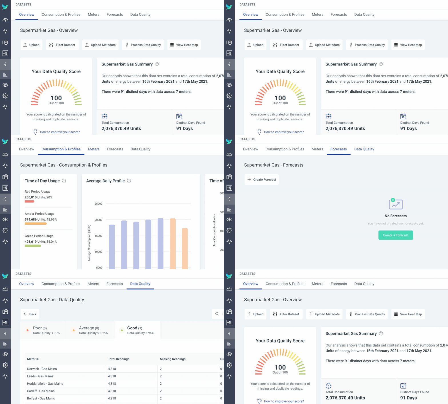
Energy Tools is a powerful module which has grown its feature set quickly! Today we’re introducing a new tabbed view when viewing a Dataset which breaks up the information in Energy Tools into categories. This allows you to access your information quickly with less scrolling to find what you’re looking for. As we add more functionality in to Energy Tools, you can expect more tabs to be added!
The Dataset view has been split up into the following tabs:
- Overview
- Consumption & Profiles
- Meters
- Forecasts
- Data Quality

Vision
The “Loss Prevention” module has been renamed to “Vision” to better reflect the direction we want to take the product and the incredible features that will be coming to the module.
Not only, has the Vision module had a name change, but it also had a rework to accommodate future work and a better user interface. Now, when you open the module, you are presented with a dynamic “Overview” page.
This overview displays the summary of the Vision assets that you use, whether they be Aisle Detectors, Points of Sale (PoS), or both! This should give you a clearer picture of the state of your assets at your locations.
Analytics
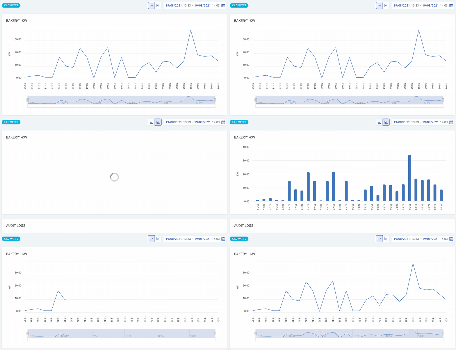
The Analytics module supports so many different kinds of data, and some of those kinds of data make more sense to be viewed in a bar graph rather than the default line graph.
Because of this, we’ve added some great new functionality that allows you to save how you want your data to be graphed out against a Sensor! If you want your Sensor to show a bar graph instead of a line graph, we’ll do it! We’ve also added a new toggle option which allows you to quickly switch between bar and line graph quickly.
We’ve also added the ability to store a default date range against a Sensor to save you from selecting a specific date range every time you view a Sensor.

This new functionality also works as expected in the Sensor Group view when viewing your Sensors grouped by Sensor type.
In addition to this, we’ve also added the ability to set the expected reading frequency for Sensors, which controls how often the Sensor status is checked and will influence the status information for your Sensor. For example, if you only expect a reading every 15 minutes, we won’t expect a reading for at least 15 minutes from the last.