

We have to consider how the colours harmonise together, what feelings they evoke, how accessible they are, and where do they draw attention? And that’s just to name a few of the considerations that go into palette design. When you start to explore it in more depth it suddenly becomes a much bigger task. In this article I’m going to outline the challenges I’ve faced, some of the decisions I’ve made and helpful tools I have used whilst creating and documenting our design system.
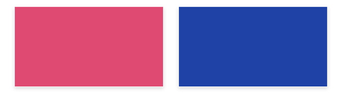
Using accent colours for high impact
At Hark we already had a set of brand guidelines which outlined our brand colour palette, this was my starting point but also led to my first decision. Do we want to incorporate brand colours into the Hark Platform? Of course, we want users to recognise the brand but then how do we make primary and secondary actions contrast against a busy UI? My solution was to introduce two new accent colours that complement the existing brand colour palette.

In doing so I can now reserve brand colours for the overarching theme of the platform while drawing attention towards in-page elements such as CTA’s, data visualisations and summary stats by making use of the accent colours. In some of the data visualisations we compare metrics so it’s really important that the accent colours contrast against each other for ease of legibility.
Creating visual hierarchy to capture attention
Our dashboards provide real-time feedback across a myriad of components, some more important than others depending on the user, so the UI’s can be complex. Colour plays a vital role in allowing users to interpret data efficiently with minimal cognitive effort. We’ve all seen UI’s that scream for your attention so loudly, that they become really overwhelming.
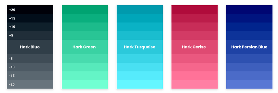
How can we prevent our UI’s looking like an painter’s palette? – we need to create visual hierarchy! In conjunction with font size and font weight, we can use colour to ‘group’ information, drawing the eye to the more important bits. So, the challenge was in how we create a sense of hierarchy without adding additional colours that would make the palette less atheistically pleasing and incoherent. We need to apply some logical rules that give us scope; so we opted for tints and shades of our primary and accent colours therefore giving us flexibility whilst containing the five palette colours. I did this by increasing/decreasing the amount of white/black by 5% increments, giving us shades that we can use for more important data and tints for the supporting data.
Here are a couple of tools I used to help get the shades and tints of your colours:
https://www.hexcolortool.com/
https://maketintsandshades.com/
Accessibility in UX design
With the additional shades, it’s important to ensure there is enough contrast between the background colours and the colour of the overlaying text. It’s imperative that you pay attention to the accessibility of your design, which is something that is often overlooked, with designs tending to opt for what looks nice. Everybody’s done it at some point – thought that something looks great and made the assumption that it would meet accessibility standards, when in actual fact it didn’t. I now use a plugin for XD called ‘Stark’ which allows me to check the contrast ratio between elements; this is now an important part of my workflow.
This was particularly helpful when defining interaction states across the platform. With so many clickable elements we needed to ensure consistency ensuring elements become familiar to users, so they begin to pre-empt how something is going to respond to their input just by its appearance, whilst remaining accessible. Colour plays an important role; whether that’s a subtle hover state on your input field or a selected state of a group of controls, be sure to remain consistent by using shades and tints on borders, text, icons and backgrounds. Taking a filter button as an example, the default state has a grey icon on a white background, when a user applies filters that buttons state should change providing visual feedback, that can be achieved by changing the icon colour and adding a 2 px coloured border, likewise if you had a checkbox field, when selected you could add that same border and change the colour of the checkbox to the one you used for the icon creating familiarity across your UI.
Coming back to drawing attention, how can we differentiate actions or notifications from the surrounding elements? It’s a good idea to define a set of ‘system colours’ that are reserved for that purpose. There is an abundance of articles online regarding the psychology of colour so I won’t bore you with that right now, but there are important principles to consider. Let’s take the colour red as an example, which is often used to indicate danger. In the real world you would stop at a red traffic light, in a UI it can be used to draw attention to actions that have consequence such as deleting, or variance changes in the data. I typically define system colours as red, green, orange and blue, ensuring they are distinctly recognisable as non-brand colours.
Finally, themes are increasing in popularity, it’s almost a user expectation that you can switch to a ‘Dark Mode’,this presents a challenge to designers. Up until now you may have developed your palette for ‘Light Mode’ but not really given a ‘Dark Mode’ much thought. It’s difficult to know where to begin; you research and try and find some kind of standard to follow but it becomes overwhelming. I started with establishing a base colour, #121212 to be precise, this would serve as my background colour in which all elements can be built upon. In a light mode we can create a sense of depth by using shadows, whereas in a dark mode that gets lost so this is where colour play’s an important role. To create depth in a dark mode use light as a guide, the closer something is to a light source the lighter it will be. This can be referred to as elevation to create a sense of depth. You can do this by taking your base colour and applying a white overlay with a low opacity such as 3%, 6%, 9% and so on, creating different elevation levels that can be used to create a sense of depth.
The other important part of your dark mode is ensuring that your accent colours are just as effective, ensuring they are accessible, still draw attention and remain true to the original theme. In order to do this I desaturated the accent colours which added more white, therefore creating more contrast between them and the elevation levels. So, to wrap up, colour plays a significant role in the way we articulate information, you should consider how colours work together to create hierarchy, draw attention, group data, signpost, convert to themes, aid the user experience and evoke emotion. Look beyond what simply looks nice and think about how a colour helps the user interpret the information you are displaying. It goes without saying that you must test your UI to see what works for your users, after all, a simple colour change can have a dramatic effect on conversion.