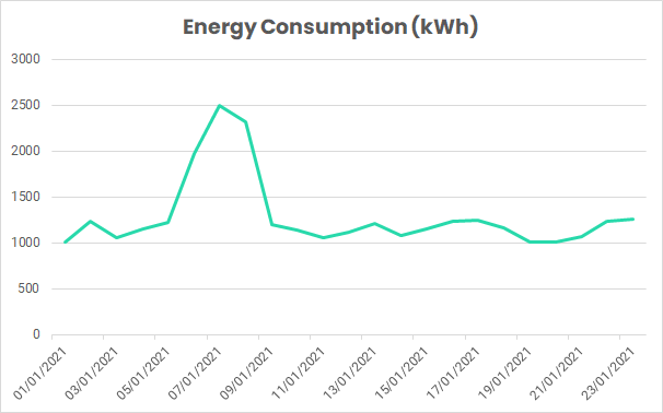
For example, consider a factory making widgets. You can see the factory’s energy consumption, in kWh, on the plot below:

The factory’s energy manager, who is responsible for ensuring a high level of efficiency, may be concerned over the spike in consumption from the 6/01 to the 08/01.
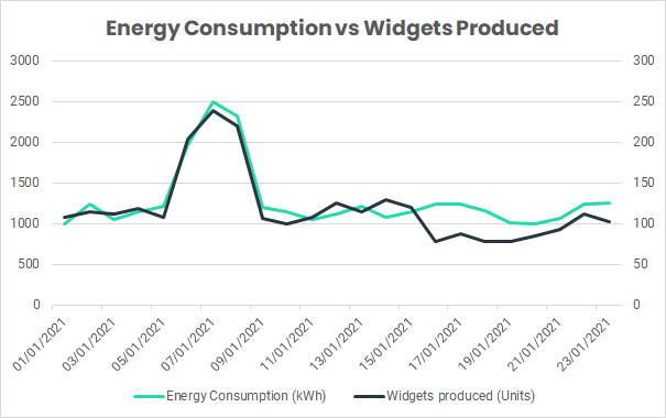
The energy manager knows the factor affecting energy consumption the most is the number of widgets produced by the factory. This is added to the plot, as seen below.

This extra data adds insight, showing that the spike in consumption is likely caused by an increase in production. This relationship can be captured by a single metric, an Energy Performance Indicator (EnPI). This shows the amount of energy used to produce one widget (kWh per Unit), and is calculated as follows:
Energy Performance Indicator = Energy Consumption Energy (kWh) ÷ Widgets Produced (# Units).
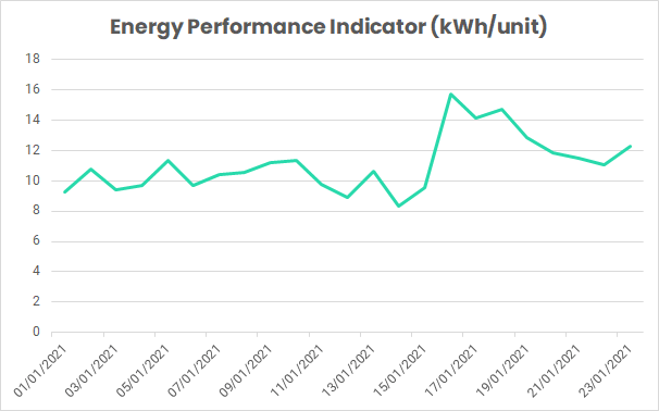
Plotting this indicator value over time gives us the following results…

We can see that the spike from the 6/01 to the 8/01 has completely disappeared, as the EnPI accounts for the increase in production. However, our attention is now brought to a spike from the 16/01 to the 18/01, which was not noticeable in previous graphs. This time, we can be sure this is not caused by an increase in production.
To investigate these results further, we could look at adding extra influencing factors into the indicator, such as weather or degree days, building occupancy, and public holidays. This increase in complexity can provide further unique insight into the drivers behind energy efficiency.
Energy performance indicators are used by leading energy professionals, providing a useful addition to the toolbox of anyone looking to improve their energy efficiency.
These indicators form part of the requirements for achieving ISO 50001 certification. Factors included in the indicator must be relevant to the organisation, and demonstrate an improvement in energy efficiency.
To learn more, or see how we use Energy Performance Indicators, get in touch at hello@harksys.com.


