
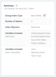
Upon clicking on an Energy Index, you’ll be presented with the Energy Index dashboard. At the top of this dashboard you will see the a Summary. This displays all the options which have been configured upon upload, and characteristics of the Energy Index.
Next to the Energy Index Summary, you will find the Observations table. This lists the bottom performers, as well as the top performers. You can toggle between them at the top of the observations table.
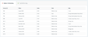
The contents of the table is as followed:
Sensor ID: The location in which the calculated performance occurred.
When: The date in which the calculated performance occurred
Index: The Energy Index score – higher scores indicating better performance.
Risk: The probability that the Energy Index calculated poses a risk. This is calculated based on the value of the Energy Index and how much the independent variables fluctuate from the norm.
Why: Potential reasons why the Energy Index was given the score it was. For example, if site area is listed in this column, a potential reason for poor performance is that the site is using too much energy based for the size of the site.
The Enery Index will also be displayed as a timeline graph. This allows you to track the results over time. This functionality is avaliable for a single meter configured Index.
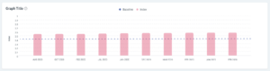
If multiple meters are present in the data, this graph will provide a graph of performance across all sites.