

Dashboards are the window into your platform, they surface the most important information giving your users the data they need, allowing them to easily navigate to the granular insight they are looking for. With that comes the challenge of presenting the right amount of information. Presenting everything at once can cause analysis-paralysis – sounds scary, right? It should, because that means we paralyse the user with an overcomplicated UI that displays so much information, that they struggle to process it. Not ideal! So here are some of my best tips for designing a dashboard your users will love.
1. Understanding Your Information
So how do we structure the information we are presenting? Firstly, it’s a good idea to speak to the wider business; software engineers, software architects and data scientists are absolute godsends to designers; you can pick their brains and ask questions about the finer details of the data, to make sure you fully understand it. I find these calls really helpful and often sketch rough ideas while talking to them as they can provide you with so much insight that really does help conceptualise solutions that are fit for purpose.
Another crucial step is putting yourself in the mindset of the user, what is it that they want to see as they land on the dashboard? In most cases, it’s very high-level detail such as status information, alerts and notice, so these should be positioned prominently – typically top left, if we follow the common reading patterns such as the F and Z reading patterns. Ensure you understand your audience, do your research, develop personas and really get to know how they are going to use your dashboard:
What is meaningful to them? What is recognisable to them?
2. Grouping And Hierarchy
Now you have a better understanding of what it is you are presenting you can begin to organise the information and form a layout based on the importance of the information and the intended user. Hierarchy is your friend here, make use of size and position by emphasising the more important information by giving it a prominent position and vice-versa. It’s important to group related information, this can be done by the use of colour and proximity, so users can see the relationship between components. The use of white space, or ‘negative’ space, helps with that logical flow. Paying attention to white space in your dashboards, allows the design to be more easily scannable therefore improving the legibility, but it also draws focus and attention by clearly segmenting different content; white space allows us to make sense of the information we are presenting.
3. Clear Language And Formatting
The language we use throughout the dashboards can make or break the user experience, again this comes back to the intended users. What language is meaningful to them? Terms that we use internally may not resonate with our users and consequently make the user start to question what they are looking at; clarity is key.
Likewise, we should not over complicate the language used. Keep labels and descriptions concise while retaining their intentions, reduce the jargon! Remember the users are glancing at the dashboards, they no doubt have busy high-pressure roles meaning they need to find information efficiently, so our job as UX designers is to make it easy as possible.
Formatting is also just as important, the way in which you format the data in your dashboard has a huge effect on cognitive load, the mental effort required to process information…
A really simple example of this is if you were to present a large number without any formatting rules like so: 1252674. You can see it’s difficult to interpret at a glance, especially if there are lots of figures like this floating around. A simple solution for this is to make use of suffixes and rounding so the figure would become 1.25M. Alternatively, you can add decimals so the number is easier to read, e.g. 1,252,674.
Another formatting consideration is the use of capitalisation on text within your dashboard, typically you use capital text conservatively, possibly for CTA actions that require attention or short headings rather than multiple lines of text where capital text would cause frustration.
4. Attractive Data Visualisation
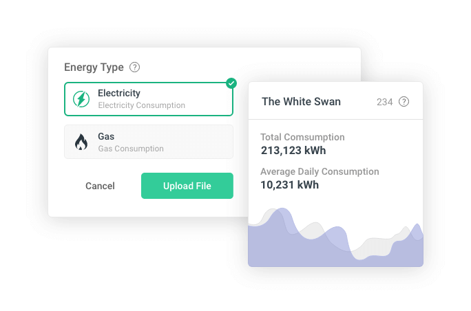
Arguably one of the most important parts of dashboard design is the way in which you visually present data, and this is intrinsically tied to the user’s journey, for example, the dashboard screen (effectively home) is where you would typically present top-level data, summaries, statuses and notices. The way in which you present this in visual form should be easy to interpret and needs to be in it’s simplest form. A number and a label are easy to digest but if you are comparing two values, then a doughnut chart might be more fitting so it’s important to look at the data to determine what the most appropriate method of visualising it is.
It’s always a task making data look visually appealing, but I genuinely love the challenge and that’s probably why I get so much satisfaction from my role. The main priority is whether the user can get the information they need efficiently, without the need to study the visualisation. We shouldn’t aim to present this all at once, presenting data is one thing, but ensuring it’s easy to read so the user can identify anomalies and trends, well, that’s a whole other thing…
If users need more information, they can then drill down and get the higher value insights. That’s where the UX comes into play; how easy is it to toggle additional data onto the line chart? How easy is it to target specific data ranges, right through to more complex querying of data that allows us to present advanced views with more detailed insight?
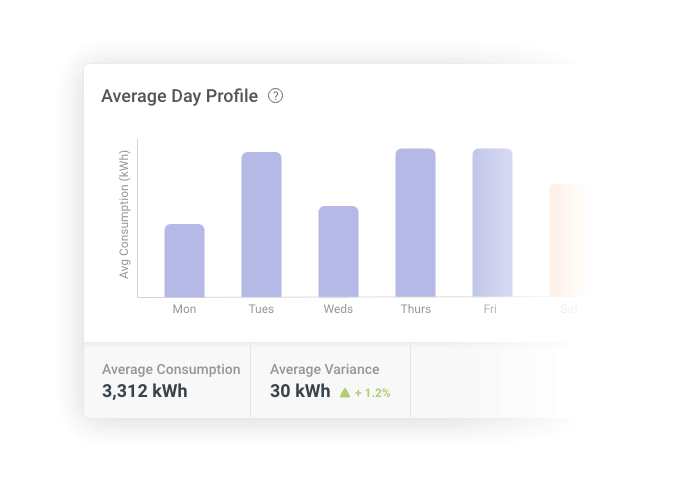
The type of data visualisations you use is important, ensure you design a visualisation type that is familiar with the data you are presenting, for example, if you are presenting time series data then a line graph or bar chart is a good choice, likewise if you want to display the relationship between your data, then a scatter graph might be more appropriate.
5. Aesthetics, Function and Meaningful
To sum up, dashboard design is more than something that looks visually pleasing, of course, we want it to look beautiful, but it needs to be functional and meaningful.
Take the time to conceptualise, don’t always look for the easy solution, look for the right one; yes it might take more time to design a dual-axis line graph than a table but if that’s the best way of presenting the data then do it. Likewise take time to understand the data, I don’t always know the subject matter I’m designing for so I make a conscious effort to do research, that could be looking at competitors or speaking to the wider team, once you understand it you can then find the appropriate component to present it. This takes time and it comes with experience, but try and look beyond the aesthetics and I guarantee your design will be better for it.