

We have multiple modules that provide insight that the naked eye can’t see; our users receive alerts when there are minute temperature fluctuations, peaks in energy consumption or suspicious activity happening in, for example, a retail store – that’s just to name a few.
Naturally, these use cases have different user types that require different levels of information, so we must provide a platform that has the users at its heart, thereby creating an intuitive, data-rich and pleasant user experience, whilst looking beautiful too. To achieve that, our platform uses common UX laws and principles such as user control, consistency, hierarchy, accessibility, feedback, and discoverability.
Let’s dive into some of those now…
User Control
User control is one of Jackob Neilsen’s usability heuristics which essentially states that users often perform actions by mistake so we should provide a clear way of undoing an unwanted action.
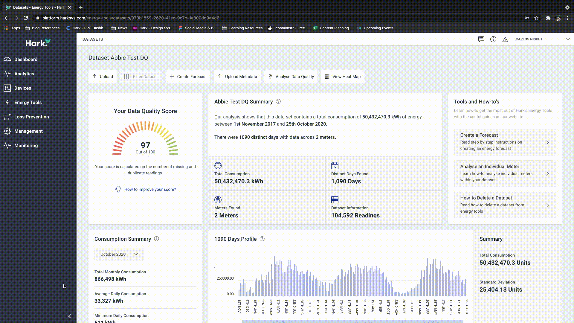
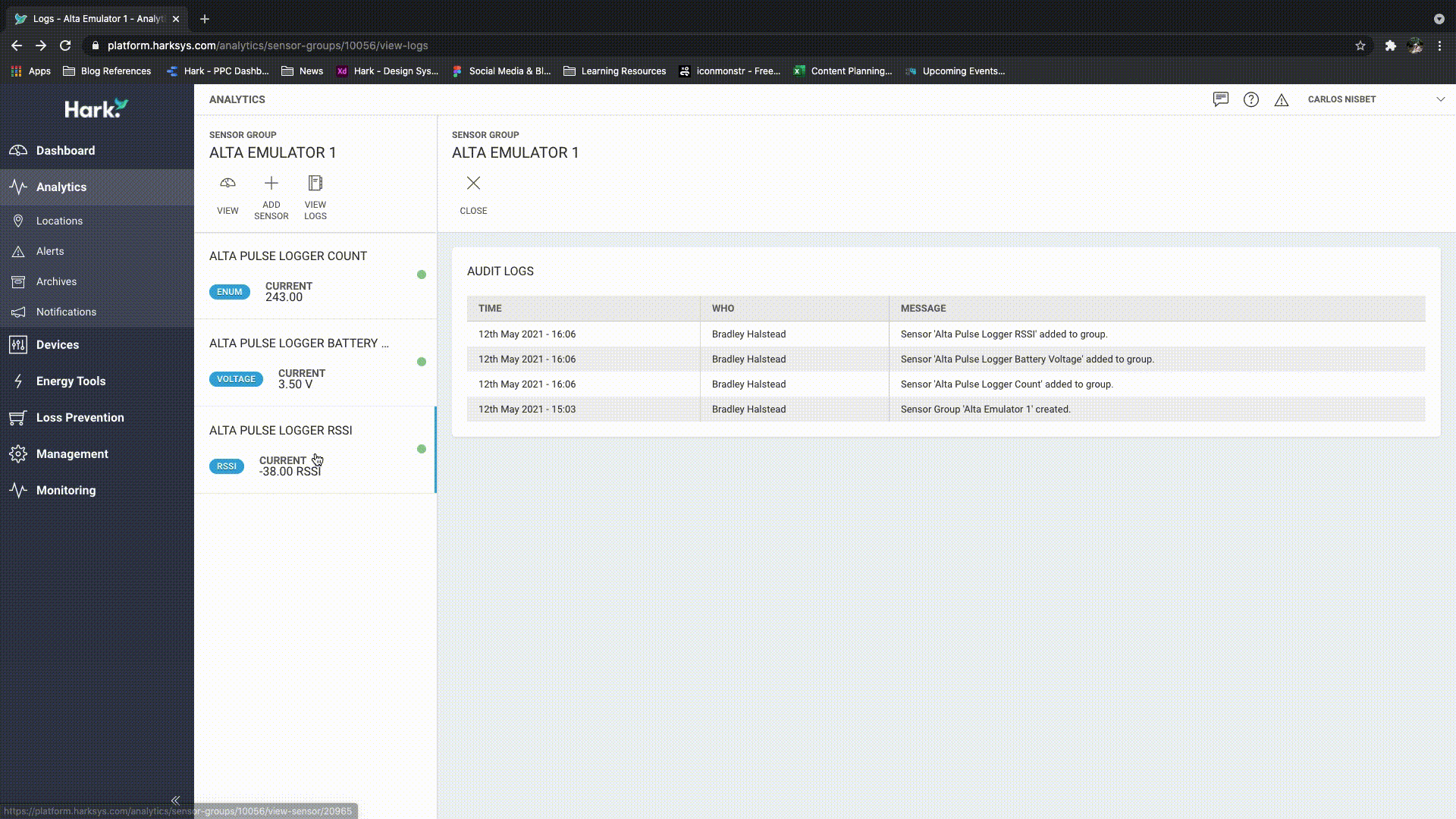
The Hark Platform allows the user to perform many actions. The way we structure our information allows users to navigate down a clear path, gradually uncovering more detail but with the use of ‘back’ buttons, breadcrumbs and tree-like navigation, users are one click away from their intended action – should they make a mistake.
We also have more complex actions such as ‘create’, this could be creating a meter or creating a report. These actions are easily accessible by our ‘control bar’ that sits in the same position regardless of the module, to ensure it becomes familiar to users, typically these types of actions display a modal where the user can easily identify ‘cancel’ or ‘close’ links.
Another common example of user control are confirmation dialogues, which allows users to recover from an unwanted action, a simple ‘Are you sure?’ dialogue before deleting something important is a must, because it’s easily done, especially on smaller handheld devices.
These relatively simple additions give the user a sense of control and confidence when using our platform, avoiding dead ends and rabbit holes.
Consistency
A system should feel and look and perform consistently, I touched upon consistency above in terms of the positioning of elements such as our ‘control bar’ but the way in which any platform functions should be consistent regardless of where the user is within the platform.
Another key development of the Hark Platform is the user interface, we have produced a detailed design system to ensure elements have certain visual characteristics depending on their actions, things such as common hover states, focussed states, active states, to name a few. This allows users to become familiar with elements within the platform and what associated actions these will have purely by their visual characteristics and the consistency of their behaviour.
Users will navigate various user interfaces throughout their day and become accustomed to how certain tasks function, so we ensure that the Hark Platform takes note of Jakob’s law, so functionality remains familiar, and users are under no illusion of what the results will be of their intended action.
Jakob’s Law
Again, as mentioned above, Jakob’s Law states that users spend time navigating other websites and platforms, so they expect your website to perform the same way as the other websites and platforms they are already familiar with.
That said, we should still be innovative but there should be a careful consideration around the value of something being done in a way other than what is deemed “the norm.”
Accessibility
Accessibility means making our Platform easy to use for everybody, including those users who have a disability. There is plenty you can do to improve the accessibility of a platform and that’s something we are passionate about here at Hark. And so, we have a number of recommendations from our update backlog that help us ensure we are doing all we can to make our Platform as accessible as possible.
Some of the ways we are trying to improve our accessibility have been defined in our design system by ensuring global accessibility specs are met. Examples of these are font size, colour contrast being above the minimum of recommendation of 4.5:1 or AAA and buttons having specific and consistent interaction styles.
We are also in the process of developing theme support so users have a choice of themes that they can apply to the Hark Platform depending on their needs. Themes such as ‘dark’ themes are commonplace and almost expected so that’s a given but we are also looking at high contrast themes and how we can make the user experience more accessible for users who are colour blind.
Discoverability
Don Norman describes good discoverability by saying, “it is possible to determine what actions are possible and the current state of the device”.
As with any interface, we needed to make the Hark Platform intuitive to use and easy to understand. Whilst there are things we can do to guide users, such as onboarding or help sections for more complex tasks, the platform should be discoverable to encourage users to confidently perform tasks such as locate the data they require, upload additional data, create custom dashboards etc.
To do this we have ensured that common actions are displayed within the same location across screens. Actions use visual cues and descriptive labels allowing them to be recognisable. Primary, secondary and tertiary styles have been applied so users know which actions are the most common.
As well as clear calls to action we have established a clear visual hierarchy by structuring content in order of priority, small but essential styles for font colour, size and weight help create structure and draw the eye naturally around the platform.
These are just some of the ways we are trying to differentiate our platform from our competitors’ platforms because our users are at the heart of what we do. There is always room for improvement too, as our user base and product offering grows, we have more opportunities to understand how we can enhance the platform further, the iterative design process continues and we can’t wait.
We’d love to chat with you so if you have any questions about the Hark Platform or UX in general then drop us a message.